Tips on Picking a Color Scheme for Your Next Professional Printing Project
September 25, 2015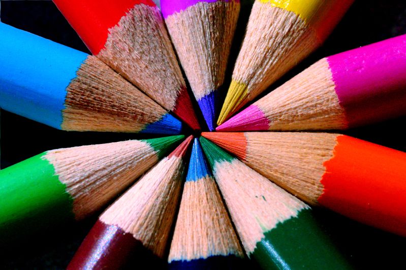
Did you know that your life is controlled by color schemes? It’s true. Colors can bring out the best, or worst, in just about anything, and a great set of colors will catch your eye, especially if used for brochures or advertising materials. Clever color schemes can also affect your mood, creating a one-of-a-kind feeling. However, picking a color scheme for a professional printing project isn’t always easy, so here are a few tips to help you decide what will work best.
Picking a Color Scheme: The Basics of Color Theory
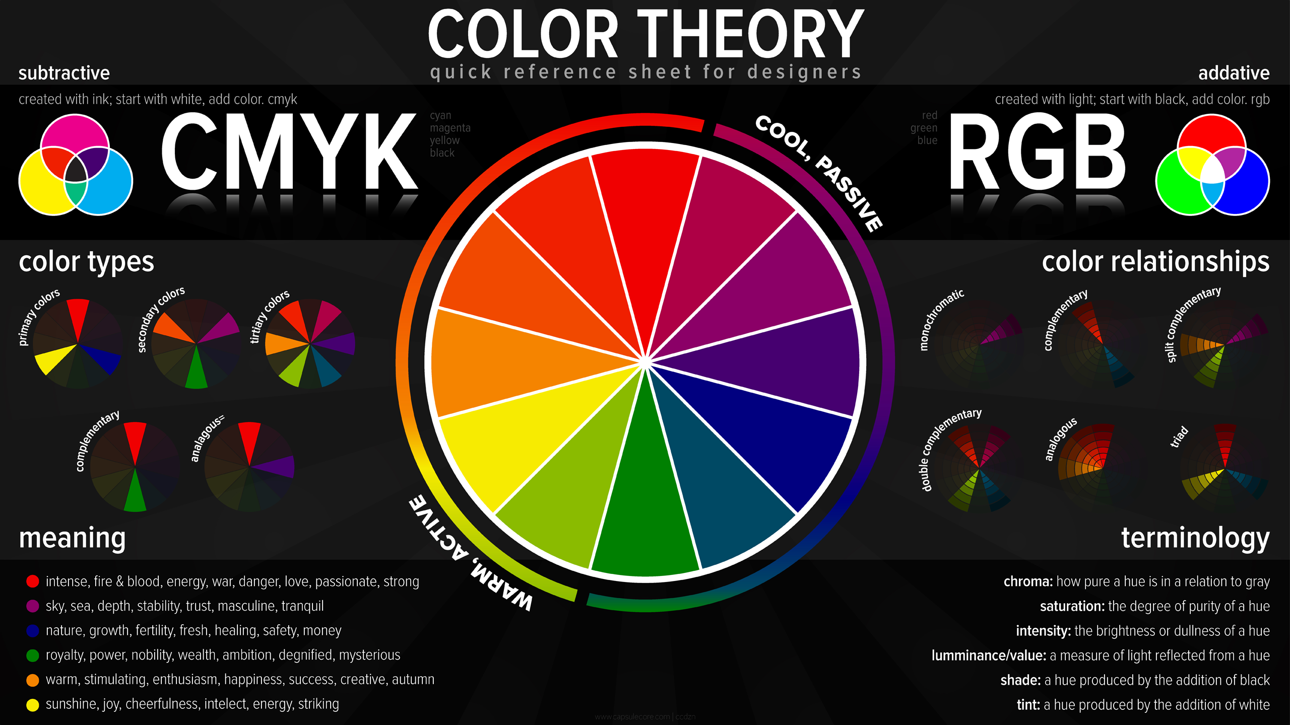
The Color Theory Wheel (Image from www.blendspace.com)
Before beginning any design/professional printing project, it never hurts to review the basics of color. Obviously, there are a ton of different approaches to take, but each one begins with knowing a little bit of color theory because, let’s face it; some colors work well together, and some colors clash. Picking a color scheme that’s too vibrant may take away from the message you want to share, and colors that are too mellow might make people pass it by.
Picking a Color Scheme: The Color Wheel
Created by Sir Isaac Newton in 1666, the color wheel is still used today as the foundation of basic color theory, and is a great tool to use when picking a color scheme. Consisting of 12 colors based on the primary colors red, yellow, and blue, the color wheel is designed in a way that virtually any of the colors you choose from will blend together, or complement each other. The wheel can then be divided in a number of ways, to create basic color palettes. For example:
- Primary, Secondary, and Tertiary Colors: Primary colors are the ones that the color wheel is based on: red, yellow, and blue. The secondary colors are green, orange, and purple, which lie in between the primary colors on the color wheel. The remaining colors are called tertiary colors, which are created by mixing primary and secondary colors.
- Warm/Cool Colors: The color wheel can also be divided into warmer and cooler colors by basically cutting it in half. The warm colors lie in between bright violet and green, and the cooler ones on the opposite side.
- Shading: You can expand upon all of the basic colors by using white, black, and grey, to create a huge variety of different tints and shades. Experimenting with this can be a great way to brainstorm color ideas for any project. You may only need to use one or two colors to bring your idea to life, filling in the rest with various shading techniques.
Techniques for Creating Color Schemes
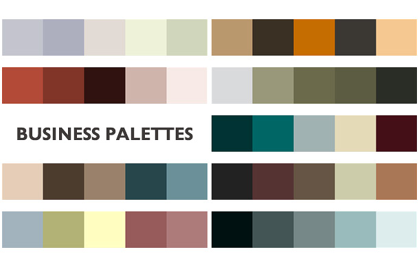
Color Schemes (Image from www.printaholic.com)
Once you’ve brushed up a bit on the basics of color theory, taking a look at some simple color schemes is a great way to get the creative juices flowing. There are a ton of different variations out there, but here are a few color schemes to use as templates while picking a color scheme:
- Complimentary: These are colors that are opposite from each other on the color wheel, such as blue and yellow or red and green. Complimentary colors can be used to created vivid, vibrant designs, but it’s important to be reserved about using them together so your design isn’t too hard on the eyes. Also, avoid using these types of colors for text.
- Analogous: These are color schemes that are created using colors next to each other on the color wheel. For example, orange, red, and violet go very well together. This type of color scheme can be very soothing, and it’s often found in nature.
- Split Complimentary: Like the name says, this one’s a clever take on the complimentary color scheme. Basically, instead of using two colors opposite each other on the color wheel, you vary this by using the two colors adjacent to one of the complimentary colors. For example, instead of using green and red, try using green, red-violet, and red orange.
Picking a Color Scheme for Communication

Photo from www.ethixbase.com
Color is much more than just pleasing to the eye, it’s also culturally significant, and an extremely important communication tool. Just stop and think for a second about the color of your national flag, how red means stop and green means go, and how camouflage clothing can bring about a certain type of mood and style. Taking the time to notice some of these things can help immensely in making informed design/printing decisions for your next professional printing project.
Set a Mood
Using a simple color scheme can be a great way to set a mood. Whether you want to create something that really jumps out or a design that sends a more relaxed message, you can use colors to your advantage. Think about your favorite colors, and how they affect your mood. Here are a few examples:
- Red: This color can stimulate positive energy, courage, strength, masculinity, or represent more negative traits like confusion and aggression. Red is a very strong color, and can be seen well from far away. It also grabs our attention and can get us excited. There’s a reason why so many people buy red sports cars.
- Blue: Extremely versatile, blue can be used to represent a variety of different moods, including intelligence, coolness, logic, coldness, and tranquility. Essentially, blue is a color that’s soothing to the mind, and it’s a very clear color, which makes it a good one for communicating a message.
- Green: One of the more relaxing colors, green portrays a message of health, vitality, equilibrium, and peace; it’s one of the most common colors in nature, so why shouldn’t it? Since green lays in the center of the color spectrum, it’s a very well-balanced color and easy on the eyes.
- Orange: A combination of yellow and red, orange can be an extremely versatile color. It can bring about a range of moods and emotions in us, including comfort, warmth, passion. Orange can also make us think about seasons (fall), food (pumpkin pie) and holidays (Halloween).
Cultural Significance

Throughout history certain colors have achieved cultural significance (Photo from CNN)
If you’re picking a color scheme for a printing project with an international audience, it’s extremely important to pay attention to the cultural significance of some colors, so as to avoid offending the audience you’re trying to communicate with. A good example of this is that, in the west, black is the color of mourning, and white is a color of strength and purity; but in Japan it’s exactly the opposite. Also, pay attention to the political implications certain colors can represent, and how that may play a role in what you’re designing. Before jumping into any professional printing project, be sure to do your research before picking a color scheme.
Nature
Relying on nature is a great way to benefit from the tools already at your disposal. Think of the colors that are “in season” when you start designing your project. Use spring colors to create a bright atmosphere, or fall colors to highlight the changing leaves. This can be a great way to get people’s attention. There are a ton of great seasonal color pallets out there from which to draw inspiration.
Branding
Image from www.thehigherlearning.com
When choosing a color scheme, whether it’s for a brochure or business cards, think about what type of vision you have for your professional printing project. If you run a business, consider branding and developing your corporate logo.
In this case, simpler is better. People are more likely to remember a color scheme that is bright but not too busy. This is where you can take all of the ideas mentioned above and put them to good use; color theory, mood, and culture. Make sure all of these things are part of your consideration when designing or picking a color scheme.
Tools
If you’re still having trouble settling on the right color scheme, try using one of the many computer programs or templates available on the web. These programs are designed to make picking a color scheme super easy, and they’re very intuitive. Programs such as Adobe Color CC and ColorExplorer were developed to make your job easier, while at the same time still building on your design preferences. Plus, as you continue to design and print things for clients, using a program will allow you to build up some great templates and color schemes to keep on hand.
Most print shops use the CMYK (cyan, magenta, yellow, black) process, which enables them to use shading to create a virtually limitless amount of colors with only these basic four. To ensure whatever colors you decide on for your print project appear on the page accurately, it helps to use a pantone color bridge guide.
If you have any more questions about picking a color scheme for your next professional printing project, feel free to contact us.